Samsung’s Galaxy Z Flip 4 is the foldable phone most people should buy - CNN Underscored
Foldable displays used to be something you'd see in sci-fi movies in a far-off futuristic setting. But as we've seen over the last few years from Samsung, displays that literally fold in half are here, and they're getting much, much better.
Samsung's Galaxy Z Flip 4 is a good example of that. The $999 Android-powered smartphone has plenty to offer for that price, including a 6.7-inch display that folds in half, shrinking down the entire footprint of the phone.
The best part? When you open the Z Flip 4, you're presented with a familiar smartphone design and experience, unlike the more expensive $1,799 Z Fold 4 that gives you a smartphone on the front and a tablet in the middle, forcing you to make conscious decisions on which screen to use.
The Z Flip 4's dual-screen approach isn't perfect, but there's a lot to like about the modern flip phone.
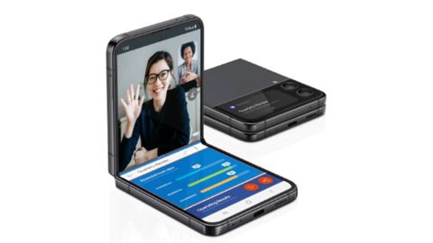
The Galaxy Z Flip 4 is the best foldable phone for most people, offering good performance and cameras within a design that's more pocket-friendly — and cooler — than your typical phone.
What we liked about it
An intuitive folding design
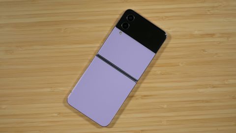
There's something addictive about taking the Z Flip 4 out of your pocket and flipping it open to reveal a display that spans the entire length of the phone. It's akin to a $999 fidget toy that also happens to connect to the internet.
Before receiving the Z Flip 4 review unit from Samsung, I'd yet to spend more than a few minutes with a phone that folded in half vertically as the Flip 4 does. I have a Galaxy Z Fold 3 of my own and have thoroughly enjoyed using it over the last year, thanks to the large tablet-like display when it's opened.
I've always thought, however, that the Z Flip 4's design made more sense because when the phone is opened up, it reveals a 6.7-inch display that looks and works like a traditional smartphone. There's a fingerprint sensor that doubles as the power button on the right edge of the phone, a volume rocker just above that and a USB-C port on the bottom of the phone for charging and data transfers. When it's open, outside of the crease that goes across the middle of the display, the Flip 4 is almost indistinguishable from the Galaxy S22+.
The 1080p resolution of the Z Flip 4's screen is clear and crisp, even though high-end Samsung phones are known for offering higher resolutions. In fact, until I looked up the exact resolution, I assumed the Z Flip 4's display was similar to the S22 Ultra's 1440p resolution.
At 6.7 inches there's plenty of room when using the Z Flip 4 with a single app open. When you start using two apps in split-screen mode, however, the display can begin to feel a bit cramped. It's entirely possible to have Chrome open on the top half and Gmail on the bottom in order to look something up and share it, but you won't want to do it all the time.
One thing I did notice while testing the Z Flip 4 is that the screen feels a little soft compared to a standard smartphone screen. This is likely a by-product of a foldable display, and it's just part of the overall experience, but I thought I'd mention it.
On the flip side (sorry, couldn't help it), when the Flip 4 is closed, you can quickly view notifications and quickly reply to messages with predefined messages, pause or skip tracks and make mobile payments with Samsung Wallet using the 1.9-inch Cover screen. You can even launch the camera app from the cover display by double-pressing the fingerprint sensor and use the screen on the front of the phone as a viewfinder to take selfies.
I liked the ability to take selfies with the phone closed, but I didn't love it. You have to tap and swipe across the small display to switch between camera modes, and I found it to be a little clunky overall. I'm sure with a lot more practice it'd be something I wouldn't mind using in a pinch, but it wouldn't be my go-to method for taking a selfie.
Even though the Flip 4 doubles in thickness when it's closed, the phone takes up much less space in your pocket and is much more comfortable than a more traditional smartphone to carry around.
Foldable displays still have some kinks to iron out — mainly the fact that there's a crease that you can see and feel — but it's amazing technology that looks and feels like it's the future of smartphone design, only you can use it right now.
Solid performance and battery life
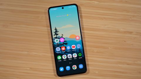
Inside the Galaxy Z Flip 4 is the Qualcomm Snapdragon 8+ Gen 1 processor, 8GB of memory, 128GB of storage and a 3,700mAh battery. All of those components combine to create a pleasant experience, both when it comes to overall performance and battery life.
Over the last week, I've yet to run out of battery during a typical day of use and during two different days of traveling from Colorado to New York. Those days consisted of an abundance of testing the cameras (more on that in a minute) along with streaming and downloading Spotify playlists while testing Samsung's new Galaxy Buds 2 Pro wireless earbuds.
Backing up my personal experience with solid battery life is the test result of running down the Z Flip 4's battery by playing a 4K video on loop. The result? Fourteen hours of continuous playback. While that score isn't as long as the OnePlus 10 Pro's 18 hours and 46 minutes, it's on par with the Galaxy S22+ and S22 Ultra, both of which have larger-capacity batteries.
As far as performance is concerned, I was impressed with how smooth the Z Flip 4 was in use. From opening games to quickly switching between the likes of Slack and Twitter while playing a YouTube video in picture-in-picture mode, I never noticed any slowdowns.
I used the benchmarking app Geekbench 5 to compare the Z Flip 4's performance scores to other smartphones — and, as expected, the Z Flip 4 performs slightly better than the Galaxy S22+ and S22 Ultra, both of which use the Snapdragon 8 Gen 1 (note it's not the 8 Plus Gen 1) processor. The Z Flip 4 scored an average of 1,315 for single-core and 3,838 for multi-core use, which is ahead of what we got from the S22+ by a good margin. However, the iPhone 13 Pro Max and its A15 Bionic processor still delivered significantly faster benchmark speeds than Samsung's phones, scoring 1,739 and 4,675 on single- and multi-core performance, respectively.
The rear cameras are reliable shooters
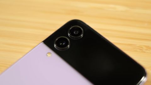
There are two main cameras that are on the back of the Z Flip 4 — or the front of the phone when it's closed. But for the purposes of this review, I'll just call them the rear-facing cameras.
There's a 12-megapixel main camera and a 12-megapixel ultrawide camera, with a total of 10x digital zoom possible. For the record, the hole punch camera that's in the main display is 10 megapixels.

The rear cameras are reliable in that once you get used to their slightly oversaturated images (which is typical of a Samsung phone), you will have plenty of confidence that the Z Flip 4 will capture the shot you want.
The 10x digital zoom remains a disappointment, with the final 10x zoom level resulting in grainy, unpleasant photos. However, portrait mode is accurate in detecting a subject and adding the fake blur effect that creates depth.

I took a handful of photos while walking along the High Line in Manhattan, all of which came out pretty good. There are some photos where a brightly lit background through the trees is blown out, showing only white in place of what should be a building or sunlight. But when the entire photo was evenly lit, such as when capturing photos of random buildings, the Z Flip 4's cameras got it right.
I also tested portrait mode by taking a photo of a random stranger and I came away pretty darn impressed. If that's you in the photo, please reach out so I can send you a full copy!
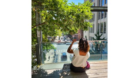
As for night photos, I wasn't blown away by the results. I took a couple of photos during a late-night little league game under the lights and the scene was decently lit; however, the overhead lights were overexposed. That said, the photos I captured are something I'd have no issues sharing online.
The Z Flip 4 can record 4K video, and from a few short clips of my kids goofing around or my dogs running across my yard, I can say it looks on par with the typical 4K video you'd expect from a smartphone. Nothing overly fancy or impressive, but it gets the job done.
I'll put it another way: There are better smartphone cameras, including on Samsung's very own Galaxy devices such as the Galaxy S22 and Z Fold 4. But if I had to use only a Z Flip 4 and its current camera arrangement, I wouldn't mind one bit.
What we didn't like about it
The Cover screen does a lot, but is it enough?
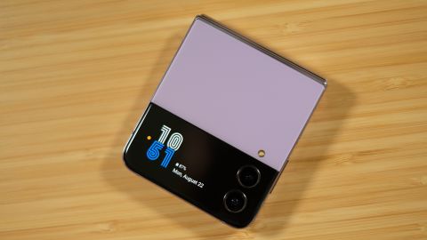
I previously mentioned how much you can get done on the Cover screen without opening the Z Flip 4 to reveal the main display inside. And while there's a lot you can do, it feels as if the Cover screen is limited in its functionality.
You wake the Cover screen with a quick double tap on the display to check the time, date and battery level of the Z Flip 4. If there's a yellow dot present, you have pending notifications that you can check by swiping in from the left edge of the screen. Open an alert and you can clear it, or for apps that support quick replies, you can reply directly from the Cover screen by selecting a predefined message.
Swiping down on the Cover screen reveals quick settings shortcuts for things like Wi-Fi, Bluetooth or your phone's flashlight. Swiping up on the screen will trigger Samsung Wallet (formerly Samsung Pay) and allow you to make a mobile payment on any NFC-compatible payment terminal. This ended up being my preferred method for mobile payments on the Z Flip 4 primarily because the NFC chip inside the phone is located in the bottom half, which makes it awkward to pay with when the Flip 4 is opened all the way. Typically the NFC chip in smartphones is near the top of the phone.
If you swipe in from the right edge of the screen you'll scroll through various widgets that show you the weather and allow you to control music playback, check alarms and set times. There are only a handful of widgets, all of which were created by Samsung. Third-party developers can't create a widget to display, say, current sports scores, or maybe view the last snapshot taken on a home security camera or pet cam. While the Cover screen is useful, it feels like users should be able to do more with it.
Flex Mode is awesome, but …
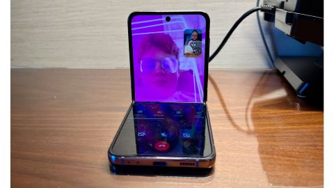
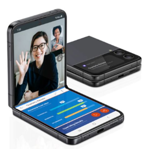
… it, too, should do more. For those unfamiliar, Flex Mode on the Z Flip 4 is triggered by only opening the screen halfway, with the top section of the screen at a 90-degree angle. In select apps, Flex mode automatically triggers a different interface, giving you controls or options on the bottom portion of the screen that are specific to that app.
For instance, in the YouTube app, the top half of the screen is taken up by the video that's currently playing, with the bottom half showing comments and the video's description. When the phone is fully open, the video takes up the top 25% of the screen.
Or in Google Meet (or is it Google Duo?) you can use Flex Mode to carry out a video call with the front-facing camera angled just right to capture you in the frame, with the video feed on the top half of the screen and video controls to add effects and the like on the bottom half of the screen.
In each of those apps, the usefulness of Flex Mode is on full display and makes a lot of sense. However, if you turn on Flex Mode for apps that don't officially support Flex Mode, it's not the same story.
With Spotify in Flex Mode, there are playback controls shown on the bottom half of the screen, with additional buttons for taking a screenshot, controlling volume and viewing notifications. It's somewhat helpful. However, if you force Flex Mode in Google Chrome, the same button bar with the same features is available, and that's it.
Sure, some of the onus is on app developers to better integrate with Flex Mode, but outside of a few apps, it's a feature that's underutilized.
The display still has a crease
As impressive as the Z Flip 4's foldable display is, there's still some room for improvement with the overall experience. For starters, there's still a very apparent crease in the middle of the display. That crease isn't only visible, but you can physically feel it as your finger moves across the screen. It's an awkward experience that I assumed I'd learn to ignore after a few days of use, but thus far, it's still very much something I notice.
On a few occasions I attempted to tap or select something located on the screen, right in the crease, and I had a hard time getting the screen to register to the tap or swipe. Other times, the display reacted exactly how you'd expect it to — opening a link or scrolling through a long email.
How it compares
 Galaxy Z Flip 4 | 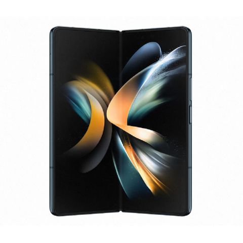 Galaxy Z Fold 4 | 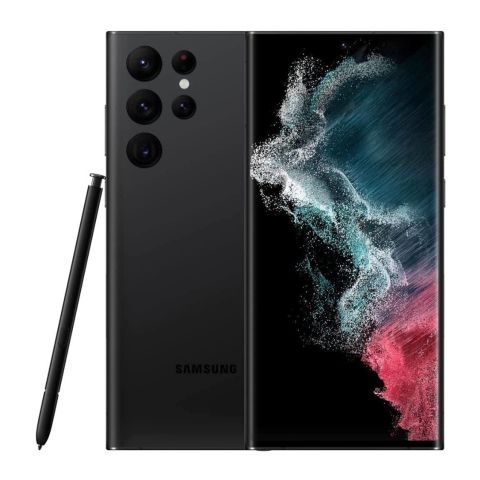 Galaxy S22 Ultra | |
|---|---|---|---|
| Main display | Snapdragon 8+ Gen 1 | Snapdragon 8+ Gen 1 | Snapdragon 8 Gen 1 |
| Cover screen | 1.9-inch Super AMOLED | 6.2-inch HD+ Dynamic AMOLED w/120Hz adaptive refresh rate | N/A |
| Processor | 6.7-inch FHD+ Dynamic AMOLED w/120Hz adaptive refresh rate | 7.6-inch QXGA+ Dynamic AMOLED w/120Hz adaptive refresh rate | 6.8-inch Infinity-O Quad HD+ Dynamic AMOLED |
| Storage | 128GB, 256GB, 512GB | 256GB, 512GB, 1TB | 128GB, 256GB, 512GB, 1TB |
| Memory | 8GB | 12GB | 8GB, 12GB |
| Battery | 3,700mAh | 4,400mAh | 5,000mAh |
| Rear cameras | 12-megapixel wide, 12-megapixel ultrawide | 50-megapixel wide, 12-megapixel ultrawide, 10-megapixel telephoto | 108-megapixel wide, 12-megapixel ultrawide, 10-megapixel telephoto 3x optical zoom, 10-megapixel telephoto 10x optical zoom |
| Front cameras | 10-megapixel | 4-megapixel under display camera, 10-megapixel | 40-megapixel |
| Connectivity | 5G, Wi-Fi 6, Bluetooth 5.2 | 5G, Wi-Fi 6E, Bluetooth 5.2 | 5G, Wi-Fi 6, Bluetooth 5.2 |
| Ports | USB-C | USB-C | USB-C |
| Colors | Bora Purple, Graphite, Pink Gold, Blue |